Use this guide to migrate from QCalendar v4.x to QCalendar v5.0.0-rc.0.
QCalendar v5 remains a Vue 3 calendar package with Quasar 2 integration. The QCalendar app extension is Vite-only and targets Quasar CLI with
@quasar/app-vitev3, but direct UI package imports can still be used in Vue/Vite projects without installing the app extension.
The information below is by no means an exhaustive list of changes and new functionality. If you see something that has been missed, please PR or let us know.
QCalendar v5.0.0-rc.0
Welcome to the QCalendar v5.0.0-rc.0 release.
This release prepares QCalendar for the next Quasar CLI Vite generation. The calendar component API is expected to remain compatible with QCalendar v4, but the supported app-extension runtime and project tooling have changed.
Requirements
| Area | QCalendar v5 beta |
|---|---|
| Vue | Vue 3 |
| Quasar | Quasar 2 |
| Quasar CLI | @quasar/app-vite >=3.0.0-rc.1 |
| App extension | Vite only |
| Node.js for this repo and CI | >=22.13 |
| Package manager for this repo | pnpm >=11.3.0 |
If your application is still using @quasar/app-webpack, migrate the application to Quasar CLI Vite before installing the QCalendar v5 app extension. If you are using QCalendar directly in a non-Quasar Vue/Vite app, install the UI package instead of the Quasar app extension.
Timestamp Utilities
QCalendar v5 no longer publishes the old QCalendar-owned Timestamp utility as a public import. Date and time helpers have moved to the standalone, framework-agnostic @timestamp-js/core package.
If your application imported Timestamp helpers from QCalendar, add @timestamp-js/core as a direct dependency and update those imports:
pnpm add @timestamp-js/coreimport { parseTimestamp, today } from '@timestamp-js/core'This is a breaking change for applications that used QCalendar’s previous Timestamp export surface directly. QCalendar components still provide timestamp-shaped objects through their documented slots and events where applicable.
Installing the beta
While QCalendar v5 is in beta, install packages from the beta dist tag:
quasar ext add @quasar/qcalendar@betaWhen QCalendar v5 is released as stable, remove the @beta tag from those commands.
App extension changes
- The app extension now requires Vite. It will stop with an error if it is installed in a non-Vite Quasar app.
- The extension registers the Vite boot file only. The previous webpack boot file has been removed.
- The extension is compatible with
@quasar/app-vite>=3.0.0-rc.1. - App extension source scripts are authored in TypeScript and compiled before publishing. The package entry points to
dist/index.jsso installed beta users do not rely on Node loading TypeScript fromnode_modules. - The extension runtime boot file is published as
dist/boot/vite-register.js. - If you generate your own boot file inside the Quasar app, it should import
defineBootfrom#q-app, matching the Quasar CLI Vite 3 alias.
If you maintain your own QCalendar boot file, update it to use #q-app:
import { defineBoot } from '#q-app'
import VuePlugin from '@quasar/quasar-ui-qcalendar/QCalendarDay'
import '@quasar/quasar-ui-qcalendar/QCalendarDay.css'

export default defineBoot(({ app }) => {
  app.use(VuePlugin)
})Direct UI package usage
Compiled component imports remain the recommended path when you only need one or two calendar types:
import { const QCalendarDay: DefineComponent<{
view: "day" | "week" | "month" | "month-interval";
shortIntervalLabel?: boolean | undefined;
intervalHeight: number | string;
intervalMinutes: number | string;
intervalStart: number | string;
intervalCount: number | string;
intervalStyle?: ((_scope: import("@quasar/quasar-ui-qcalendar/dist/types/composables/useInterval.js").Scope) => any) | undefined;
intervalClass?: ((_scope: import("@quasar/quasar-ui-qcalendar/dist/types/composables/useInterval.js").Scope) => string) | undefined;
weekdayStyle?: ((_scope: import("@quasar/quasar-ui-qcalendar/dist/types/composables/useInterval.js").Scope) => any) | undefined;
weekdayClass?: ((_scope: import("@quasar/quasar-ui-qcalendar/dist/types/composables/useInterval.js").Scope) => string) | undefined;
... 42 more ...;
useNavigation: boolean;
}, ... 18 more ..., any>
Import the component stylesheet alongside the component:
import '@quasar/quasar-ui-qcalendar/QCalendarDay.css'Direct src/ imports are still available for advanced use cases. With Quasar CLI Vite 3, dependency transpilation is automatic, so no additional transpile-dependency configuration is needed.
See Installation Types for more installation examples.
Contributor tooling changes
The QCalendar repository now uses:
pnpm@11.4.0- Node.js
>=22.13 oxlintinstead of ESLintoxfmtinstead of Prettier
Use the existing scripts for local verification:
pnpm format:check
pnpm lint
pnpm test
pnpm buildLegacy notes: QCalendar v3 to v4
The historical notes below can help if you are migrating an older application from QCalendar v3.x. Apply these changes before applying the QCalendar v5 notes above.
QCalendar v4.0.0
QCalendar v4.0.0 was the Vue 3 and Quasar 2 rewrite, with over 90% of QCalendar rewritten.
QCalendar v4.x rewritten to use Vue v3 Composition API
This means you get better in-editor auto-completion support amongst many other advantages.
QCalendar v4.1.0 rewritten fully in TypeScript
Again, this means better in-editor auto-completion support amongst many other advantages.
New calendar component
QCalendarTask was added for writing task-oriented calendars, like timesheets and Gantt-like calendars. Use it to track tasks and events.
Calendar types
Previously, the actual QCalendar component was a wrapper around other calendar components. You could specify which component-type to use via the view property (ex: month, week, agenda, etc). There were a LOT of different views. These components have now been made available on an individual basis. This is better for tree-shaking.
However, there is still a QCalendar (wrapper) component and if you have an edge-case that needs the multi-component support the new property to use is mode because some calendar’s still need the view property. The available values are: day, month, agenda, resource, scheduler and task.
If you want to take an advantage of a smaller foot-print then you have the option of importing each calendar type on an individual basis. For this, you will need to NOT be using the QCalendar app-extension, as this will import the QCalendar (wrapper). Instead, you will want to install the UI component directly into your package.json
See Installation Types for more information.
Common changes
Properties
the model property
valuehas been renamed tomodelValue(Vue 3 convention). The default has been changed to the current date. You no longer need to pass an empty string ('') for the current date, just passnullorundefinedor set toparseDate(new Date()).dateortoday()(you can importparseDateandtodayfrom@quasar/quasar-ui-qcalendar.the property
resourceshas been changed tomodelResources. You can now add your resources asv-model:model-resources="resources".
| Name | Previously | Calendar |
|---|---|---|
| model-value | value | All |
| no-header | hide-header | All |
| no-outside-days | hide-outside-days | Month |
| column-header-before | removed | Day, Scheduler |
| column-header-after | removed | Day, Scheduler |
| model-resources | resources | Scheduler, Resource |
Slots
Below is a list of all existing slots. Some are new, some have changed and some remain unchanged, but their slot data may or may not have changed, but documenting here for convenience’s sake.
| Name | Previously | Scope | Calendar |
|---|---|---|---|
| head-intervals | intervals-header | { scope: { timestamps: Array, date: String } } | QCalendarDay |
| head-resources | scheduler-resources-header | { scope: { timestamps: Array, resources: Array, date: String } } | QCalendarScheduler |
| head-resources | resources-header | { scope: { timestamps: Array, resources: Array, date: String } } | QCalendarResource |
| head-tasks | { scope: { start: Object, end: Object } } | QCalendarTask | |
| head-day | { scope: { timestamp: Object, columnIndex: Number, timeStartPos: ƒ, timeDurationHeight: ƒ } } | QCalendarDay, QCalendarAgenda | |
| head-day | { scope: { timestamp: Object, activeDate: Boolean, droppable: Boolean } } | QCalendarScheduler, QCalendarTask | |
| head-date | new | { scope: { timestamp: Object, columnIndex: Number, timeStartPos: ƒ, timeDurationHeight: ƒ } } | QCalendarDay, QCalendarAgenda |
| head-date | new | { scope: { timestamp: Object, activeDate: Boolean, droppable: Boolean } } | QCalendarScheduler, QCalendarTask |
| head-weekday-label | day-header-label | { scope: { timestamp: Object, timeStartPos: ƒ, timeDurationHeight: ƒ } } | QCalendarDay, QCalendarAgenda |
| head-weekday-label | day-header-label | { scope: { timestamp: Object, shortWeekdayLabel: Boolean } } | QCalendarMonth |
| head-weekday-label | { scope: { timestamp: Object } } | QCalendarTask | |
| head-day-label | day-label | { scope: { dayLabel: String, timestamp: Object, activeDate: Boolean } } | QCalendarDay, QCalendarAgenda, QCalendarScheduler |
| head-day-label | day-label | { scope: { dayLabel: String, timestamp: Object, activeDate: Boolean, outside: Boolean, selectedDate: Boolean, miniMode: Boolean } } | QCalendarMonth |
| head-day-label | day-label | { scope: { dayLabel: String, timestamp: Object, activeDate: Boolean } } | QCalendarTask |
| head-day-button | day-btn | { scope: { dayLabel: String, timestamp: Object, activeDate: Boolean } } | QCalendarDay, QCalendarMonth, QCalendarAgenda, QCalendarScheduler |
| head-day-button | day-btn | { scope: { dayLabel: String, timestamp: Object, activeDate: Boolean, outside: Boolean, selectedDate: Boolean, miniMode: Boolean } } | QCalendarMonth |
| head-day-button | { scope: { dayLabel: String, timestamp: Object, activeDate: Boolean } } | QCalendarTask | |
| head-day-button-value | QCalendarDay | ||
| head-day-event | day-header | { scope: { timestamp: Object, timeStartPos: ƒ, timeDurationHeight: ƒ } } | QCalendarDay, QCalendarAgenda |
| head-day-event | day-header | { scope: { weekday: Number, timestamp: Object, days: Array, index: NUmber, miniMode: Boolean, activeDate: Boolean, disabled: Boolean } } | QCalendarMonth |
| head-days-events | new | { scope: { timestamps: Array, ref: ref() } } | QCalendarDay, QCalendarAgenda |
| head-row-events | new | QCalendarMonth | |
| head-workweek | workweek-header | { scope: { start: Object, end: Object, miniMode: Boolean } } | QCalendarMonth |
| head-day | { scope: { weekday: Number, timestamp: Object, days: Array, index: Number, miniMode: Boolean } } | QCalendarMonth | |
| head-day-event | new | { scope: { timestamp: Object, activeDate: Boolean, droppable: Boolean} } | QCalendarMonth |
| head-column | { scope: { column: Number, index: Number, days: Array } } | QCalendarAgenda | |
| head-column-label | { scope: { column: Object } } | QCalendarAgenda | |
| column-header-before | { scope: { timestamp: Object, columnIndex: Number } } | QCalendarDay, QCalendarScheduler | |
| column-header-after | { scope: { timestamp: Object, columnIndex: Number } } | QCalendarDay, QCalendarScheduler | |
| column | { scope: { column: Object, days: Array, index: Number } } | QCalendarAgenda | |
| day-container | { scope: { days: Array } } | QCalendarDay, QCalendarAgenda | |
| day-body | { scope: { timestamp: Object, timeStartPos: ƒ, timeDurationHeight: ƒ } } | QCalendarDay | |
| day-interval | interval | { scope: { timestamp: Object, timeStartPos: ƒ, timeDurationHeight: ƒ } } | QCalendarDay |
| interval-label | new | { scope: { timestamp: Object, label: String, index: Number, droppable: Boolean } } | QCalendarDay, QCalendarResource |
| day-of-year | { scope: { timestamp: Object } } | QCalendarMonth | |
| month-label | { scope: { monthLabel: String, timestamp: Object, miniMode: Boolean } } | QCalendarMonth | |
| week | { scope: { week: Array, weekdays, miniMode: Boolean } } | QCalendarMonth | |
| week-days | { scope: { week: Array, weekdays, miniMode: Boolean } } | QCalendarMonth | |
| workweek | { scope: { workWeekLabel: String, week: Array, miniMode: Boolean } } | QCalendarMonth | |
| day | { scope: { outside: Boolean, timestamp: Object, miniMode: Boolean } } | QCalendarMonth | |
| day | { scope: { timestamp: Object, columnIndex: Number } } | QCalendarAgenda | |
| day | { scope: { timestamp: Object, columnIndex: Number, resource: Object, resourceIndex: Number, indentLevel: Number, activeDate: Boolean, droppable: Boolean } } | QCalendarScheduler | |
| day | { scope: { timestamp: Object, task: Object, taskIndex: Number, activeDate: Boolean } } | QCalendarTask | |
| days | { scope: { timestamps: Array, task: Object, taskIndex: Number, cellWidth: Number } } | QCalendarTask | |
| resource-label | { scope: { timestamps: Array, resource: Object, resourceIndex: Number, indentLevel: Number, label: String, droppable: Boolean } } | QCalendarResource, QCalendarScheduler | |
| resource-intervals | { scope: {timestamps: Array, resource: Object, resourceIndex: Number, timeStartPosX: ƒ, timeDurationWidth: ƒ } } | QCalendarResource | |
| resource-interval | { scope: { timestamp: Object, resource: Object, resourceIndex: Number, ActiveDate: Boolean, droppable: Boolean } } | QCalendarResource | |
| resource-days | new | { scope: { timestamps: Array, resource: Object, resourceIndex: Number, indentLevel: Number, expanded: Boolean, cellWidth: String } } | QCalendarScheduler |
| task | { scope: { start: Object, end: Object, task: Object, taskIndex: Number, expanded: Boolean } } | QCalendarTask | |
| footer-task | { scope: { start: Object, end: Object, task: Object, taskIndex: Number} } | QCalendarTask | |
| footer-day | { scope: { timestamp: Object, footer: Object, index: Number} } | QCalendarTask | |
| title-task | { scope: { start: Object, end: Object, title: Object, index: Number, cellWidth: Number} } | QCalendarTask | |
| title-day | { scope: { timestamp: Object, title: Object, index: Number, cellWidth: Number} } | QCalendarTask |
Events
onChange
The emitted change event has changed. The passed object still contains start and end. However, these are now date strings instead of timestamp objects. Additionally, a new days array has been added that does contain timestamp objects.
Mouse Events
- all mouse events with a
2on the end can have the2removed - all mouse events using
:separator should be changed to-(vue3 best practices) - examples:
@click-date="onClickDate",@click-time="onClickTime",@click-interval="onClickInterval", …
Drag and drop
- All drag and drop function signatures have changed.
timestamphas been removed, butscopehas been added which containstimestamp. Now, the signature looks like this:dragDropFunc(e, type, scope), where dragDropFunc is one ofdrag-enter-func,drag-leave-func,drag-over-funcordrop-func. These are properties to the calendar which take a function. The function must return true if you want thedroppableattribute in the scoped data. You can then use thedroppableattribute withday-style,day-class,interval-style, orinterval-classto change the styling of the cell to indicate a drop zone. The second parametertype, will be one ofday,head-day,interval, orresourceso you know where the drag and drop is being handled. When using this technique, avoid changing borders, otherwise the UX will not look nice. Instead, use abox-shadoweffect (ie:box-shadow: inset 0 0 0 1px blue). - Also be aware, that for drag and drop to work correctly, both
drag-enter-funcanddrag-over-funcneed to callpreventDefaulton the passed in event to prevent default handling by the browser. - css classes ending in
--droppablehave been removed.
New Changes Other
- For QCalendarMonth there is no longer a set minimum height of 5.0em. Use the new property
day-min-heightto control the minimum height of a day cell. And, also remember that ifday-heightis set to"0"then the height will automatically grow according to the content, otherwise ifday-heightis set to anything other than"0"the height of a day cell will be fixed. - For QCalendarResource and QCalendarScheduler there is no longer a
resource-widthproperty. Instead, use the css variable--calendar-resources-width.
New functionality
Properties
interval-style,day-styleandday-classall receive a scope object- new (QCalendarDay)
interval-classthat will be called when drawing each interval to add extra css classes in object form. - new
min-weekday-length(default:1). This property is used for fluid text length. The browser supportslongandshortformats. This is an extra short format taken from the beginning characters of the browser’sshortformat. There are some languages that begin with the same character, so having this set to 1 (one) may not work. In that case, depending on your locale, set it to two or more. - new
weekday-breakpoints(default:[75, 35]). This is the cell width breakpoint for the fluid text length. At the first breakpoint, this is where the calendar will use theshortformat, unlessshort-weekday-labelorshort-month-labelare already being used. The second breakpoint is for the extra short format will be used. To not use a breakpoint, set it to 0. - new
day-min-heightorresource-min-heightproperty is to set the min-height of a calendar cell. Use this instead of staticday-height, orresource-height, when you want calendar rows to automatically grow in height depending on content. - new
date-type(default:round), values['round', 'rounded', 'square'] - new
weekday-align(default:center), values['left', 'center', 'right'] - new
date-align(default:center), values['left', 'center', 'right'] - new (QCalendarDay)
date-header(default:stacked), values['stacked', 'inline', 'inverted']. This allows you to have the date-header area displayed inline. When theinlinevalue is used, the placement is controlled by theweekday-alignanddate-alignproperties. Using theinvertedvalue is the exact opposite ofinlinedisplay for right/left placement. This image will explain the QCalendarDay alignment: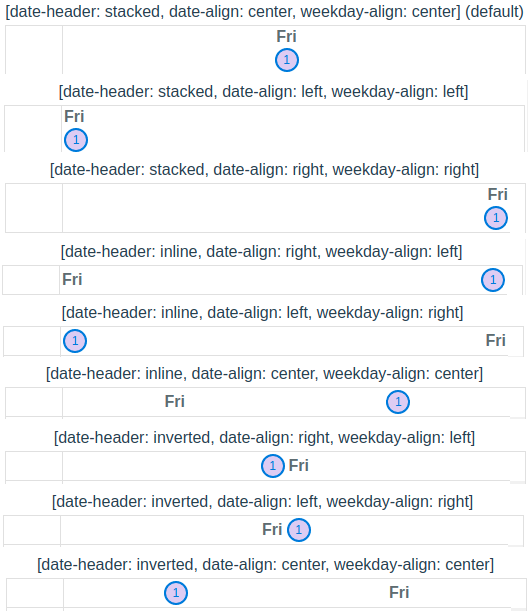
- new
use-navigationproperty turns on keyboard focus navigation. This takes into account weekday skips (ie: weekdays not being displayed).WARNING
Do not use
use-navigationwith more than one calendar at a time.TIP
use with
no-active-datefor better visual UX andfocusablefor visual acuity.- QCalendarMonth: left navigates to previous day, right navigates to next day, up takes you to previous week, down navigates to next week, home navigates to start of month, end navigates to end of month, pgUp navigates to previous month and pgDown navigates to next month.
- QCalendarDay is a bit more complicated. There is both weekday navigation and interval navigation [wip]. When focused on a weekday:
- view=“day”: left navigates to previous day and right navigates to next day. home, end, pgUp and pgDown have no meaning.
- view=“week”: left navigates to previous day, right navigates to next day, home navigates to the beginning of the week and end navigates to the end of the week.
- view=“month-interval”: left navigates to previous day, right navigates to next day, home navigates to the beginning of the month and end navigates to the end of the month.
- All calendars have additional drag and drop functionality (as props). They are:
drag-enter-func,drag-over-func,drag-leave-funcanddrop-func. The arguments are specific for the drag and drop operations, so look them up in the API docs. Each function should return a boolean (true/false) as to whether the item (day, interval, etc) should receive adroppableflag in the scoped object. This is handy when using one of the styling classes (ie:dayClass) to visually modify the calendar cell when an item can be dropped. month-label-sizein QCalendarMonth has additional values added:xxsandxxl. The values now are as follows:xxs=‘.4em’,xs=‘.6em’,sm=‘.8em’,md=‘1.0em’,lg=‘1.2em’,xl=‘1.4em’ andxxl=‘1.6em’. As well, you can pass in your own value (ex: ‘0.75em’, ‘11px’, etc)breakpointproperty values are as follows:xs=‘300’,sm=‘350’,md=‘400’,lg=‘450’ andxl=‘500’. As well, you can pass in your own value as long as it is a number which will be used as pixels.- property
min-weeksnow works as expected. This is useful when rendering month calendars so they have a fixed height from month-to-month. Most common would be:min-weeks="6". Some months may show 4, 5 or 6 weeks, depending on which weekday the start of the month falls. Hint: Use:min-weeks="6"inmini-modewhen using multi-month selection strategies. - new
hoverableproperty (all calendars). Turns on mouse hover effect. - new
focusableproperty (all calendars). Use in conjunction with theuse-navigationproperty for visual acuity. - new property
day-min-height(QCalendarMonth) sets amin-heighton a date cell. - new property
focus-type(QCalendarMonth) specifies the item that gets focused when propertyfocusableis true. Options aredayanddate,weekdayandresource(Default:date). - Calendars with hierarchical children (ie: scheduler and resource) now have better animation when expanding a row.
Events
- QCalendarMonth new event
mini-modeemits true/false whenever it changes. - The
changeevent now has an array of associateddays - QCalendarScheduler new event
resource-expandedemits an object containingexpanded(Boolean) andscope(resource, days, resourceIndex, indentLevel, label). This is emitted on hierarchical parents when the side chevron is clicked.
New Functionality Other
- There is a new look for calendars that have scrollbars (not Firefox, it will still have default scrollbars).
- The top-level calendar
divnow gets thelangattribute based on the passed inlocaleproperty (default:en-US). This allows all descendants to word-break appropriately, by the browser, based on the language. - Functionality has been added for tab (tabindex) support. Users can now use
TabandShift+Tabto navigate the calendar. Add the newfocusableproperty to have this functionality. - Allow calendar date selection via keyboard (Enter or Space keys) when
focusableproperty is set. - When using
max-daysproperty (for contiguous days displayed) and clicking on a date, the calendar no longer navigates to the selected date, which previously became first date in the visible days. ie: the calendar is static until a new date that is not visible is selected programmatically, by v-model or prev/next/move methods are used (max-daysdoes not apply to constrainedweekandmonthviews). - QCalendarDay/QCalendarAgenda now has a slot for head days (
head-days-events) that is a contiguous row for all displayed days. This allows for all-day events that are more than one day to be a singular item. Be sure to create a wrapper div with absolute positioning OR relative positioning and add empty events that are transparent to the user to push visible events to their proper positioning. Because absolute positioned div’s are outside of the browser’s normal flow, you need to set an explicit height on your first child and use the passed in ref from the slot data (<template #head-days-events="{ scope: { days, ref } }">) and place the ref (:ref="ref") properly for this to work. Also, you probably should not use thehead-days-eventsin conjunction with thehead-day-eventslot. Thehead-day-eventslot is regulated to that day only and potential overlap may occur that would not be a good UX. - All calendars will automatically auto-switch the weekday length based on the width of the calendar cell.
- For calendars that show the month on the first day of the month, the text will automatically switch the month length based on width of the calendar cell.